
Many of you will have seen examples of card based layouts, mainly for new apps and they are heavily featured in Google’s multiple web application services. Cards are a great way of ‘chunking’ and containing text and serve a dual purpose for user interface. Firstly, the cards group information together to avoid a hideous wall of text. This makes it easier for users to scan over the content laid out before them and pick out what they want. They also act as containers which are almost infinitely programmable to flex and resize according to screen sizes or resolution, therefore easily fitting a huge range of devices.
 Cards also aren’t heavy on code or graphics, they are kept simple so as to not distract from the content they are intended to display and as they won’t put added strain on any CPUs. This keeps loading times down, whether it’s an operating system layout like Windows 8 or 10 start screen, or a web app like Google Cards that display live weather and news updates.
It seems that this way of designing has finally started to seep into web design too. Whilst most sites that do adopt cards into the layout, they aren’t used heavily to avoid creating another type of wall of information that will put users off – If we think about the cards being stacked up on a website viewed on a big, high res screen that can be populated by a lot of cards, the texture could start to mimic that of a brick wall. Not a terribly engaging thought. However, I have seen many sites recently, along with a few recognisable WordPress themes, break the pages up with bands spanning the wide of a website, in which will contain some cards, maybe with a parallax sliding around in the background. These cards quite often contain contact details or even form the layout for package options. I find this as an increasingly effective way of breaking up a web page from images or longer articles that are more taxing on the eyes, ‘chunking’ important information together and making it easy to digest. This is in contrast with a handful of examples that hit you with a homepage full of cards, set out like a Windows Mobile home screen. This tends to work better with portfolio or catalogue sites with no more than two columns, where the cards are used to set out images and categories and not too much text.
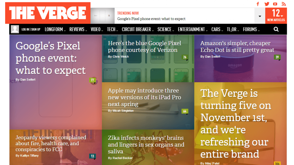
To add to ever growing reasons for the fondness of card layouts is that they just fit so well and can fill a space without cramming it. Many developers don’t just dive into building a website head first, but still use a more planned and thought out method, perhaps building web frame designs in Photoshop or Fireworks first (yes, people still use Fireworks for UI design!). I remember meticulously placing guidelines in reference to the rulers, up and down a crammed canvas with grouped images and trying to use the Snap To function to evenly distribute the content. Cards would fit so well to this, as well as being easy to program responsively, as designs that adopt Bootstrap (there are other responsive design tools out there to choose from) work via columns and grids to measure how to resize, stretch and squash or just move and restructure containers. A fitting example is shown on our left in the form of one of my favorite sites to trawl for industry news – This is how The Verge’s homepage looks on desktop, utilising a very colourful card layout.
So it would appear we now have the perfect answer for both designers and user, keeping things simple making everything easier for both sides. Only, I find UI design to be like fashion – it changes all the time according to peoples tastes, but I’d stake a bet that we see these cards around in many iterations of UI for quite some time to come.