Fortune magazine, best known for the Fortune 500, a ranked article of the worlds top companies based on revenue, as of last week changed it’s logo. The aim is to remind people that the world of business changes quickly and Fortune will change with it. Their new logo is more crisp and clean and modern, opting for a sans-serif typeface instead of the prestige brought by the recognisable serif fonts of past.
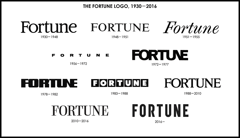
As you can see from the next image below, Fortune like changing their logo, or ‘Faceplate’ as they are now accustomed to calling it. This new logo marks the tenth in line of the company’s 86 years of publishing, some logos lasting just 3 years and others as long as 22, critics could say this shows a lack of decisiveness about the company’s visual identity and how they want to come across.

On the cover page of the magazine the logo doesn’t look too bad, it looks good even. Although, I would expect fans a subscribers may prefer the last logo over the new, as the serif typeface not only exudes more prestige, but is also more interesting to look at, perhaps seeming that more time and care has been put into it’s development.
Whilst we probably shouldn’t knock the new logo too much, if it does reflect the company’s ethos with a new clean cut look, it could be said that it would look more at home atop a magazine for games or motoring. Nevertheless, the logo may change yet again in just a few short years.
